Apple UI MCP
Build Apple Style UI UX Design with an MCP. Apple UI MCP is a Model Context Protocol tool that generates Apple Human Interface Guidelines-compliant UI components for multiple platforms. It analyzes codebases for design compliance, generates pre-styled components for React, SwiftUI, React Native, Tailwind, and CSS, and provides access to Apple design guidelines covering colors, typography, spacing, and animations.
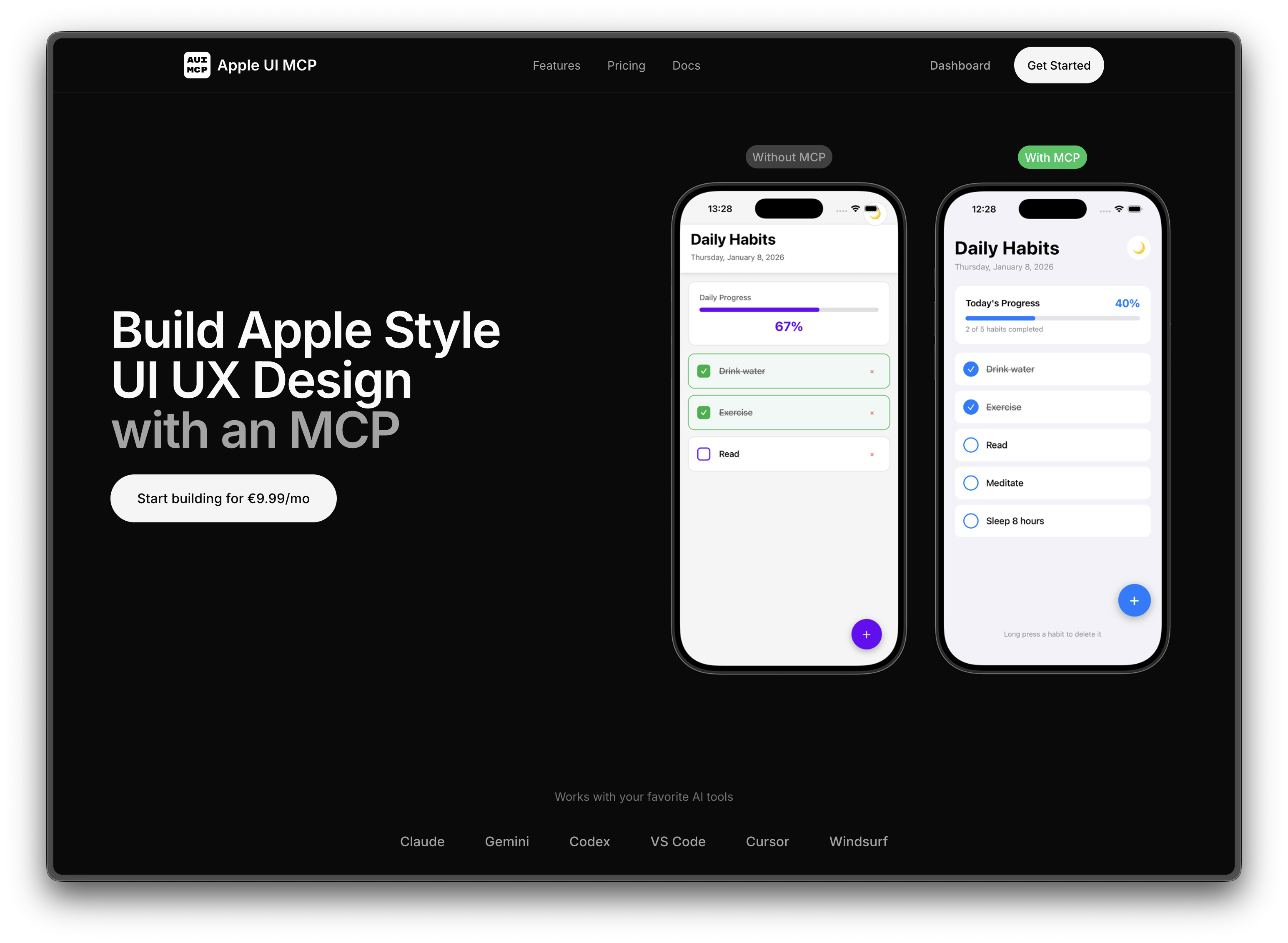
Building UI that follows Apple's Human Interface Guidelines is time-consuming and requires deep knowledge of Apple's design system. Developers often struggle to maintain consistency across platforms while adhering to Apple's strict design principles, leading to inconsistent user experiences and design debt.
Powerful features for
modern users
Everything you need to stay productive and connected, designed with simplicity and efficiency in mind.
Design Review Tool
Analyze your codebase for Apple HIG compliance. Get scores, identify issues, and receive actionable recommendations to improve your design.
Component Generator
Generate 30+ pre-styled component types for React, SwiftUI, React Native, Tailwind, and CSS. All components follow Apple design principles.
Style Guide Access
Access comprehensive Apple design guidelines covering colors, typography, spacing, and animations directly within your workflow.
Multi-Platform Output
Generate components for React, SwiftUI, React Native, Tailwind CSS, and plain CSS from a single source of truth.
AI Tool Integration
Works seamlessly with Claude, Gemini, Codex, VS Code, Cursor, and Windsurf through the Model Context Protocol.
Apple Design System
Built-in knowledge of Apple's color palettes, SF symbols, typography scales, and animation curves for authentic Apple experiences.